Designing the Smartest Product Discovery Platform Relevant, Personalised Search that Converts Shoppers to Buyers
Turning Search from a Utility into a Revenue Driver
Unbxd's search engine was powerful enough to influence millions of customer queries a day — but the console controlling it was too complex for the merchandisers who depended on it, forcing them through engineering for routine tasks. I led the redesign that closed that gap.
Powerful Platform. Painful Experience.
The merchandising platform was powerful, but merchandisers could not independently perform many of their day-to-day tasks. Routine actions often required engineering support, creating delays, reducing efficiency, and limiting their ability to respond quickly to business needs.
"I know what I want to do — boost seasonal products for a campaign — but I can never remember the steps. I end up calling our dev team every single time and it kills the momentum."
— Merchandising Manager, Mid-market Retail Client
Two Personas, One Console
Discovery surfaced two distinct relationships with the platform — merchandisers who configure search day-to-day, ranging from daily, deep-control users to occasional campaign owners, and analysts who depend on the data search produces but rarely touch configuration at all.
- Goal: empower merchandisers to influence what customers see, discover, and buy by providing self-service tools that eliminate engineering bottlenecks and increase business agility
- Frustration: discovery revealed a critical gap between customer needs and operational agility. Nearly 30% of searches failed due to unrecognized misspellings, synonyms, and product terminology, leading to immediate customer drop-off. The teams best equipped to solve these issues—merchandisers—were unable to act independently. Every search optimization required engineering support, transforming quick customer-focused improvements into lengthy ticketing workflows and slowing the organization's ability to respond to customer behavior
- Frequency: daily for high-volume catalogs, a few sessions a month for occasional sale edits — either way, a missed query meant a missed sale
- Goal: understand how customers search, identify emerging trends early, and connect search behavior to business outcomes such as revenue, conversion, and product performance
- Frustration: reports provided large volumes of raw search data but lacked meaningful insights, making it difficult to identify opportunities, prioritize actions, or communicate impact to leadership
- Frequency: weekly user who primarily consumes dashboards and reports, with little to no involvement in configuring merchandising rules or platform settings
Understanding the Merchandiser's Mental Model
I conducted a structured research programme covering contextual interviews, console session recordings, and competitive analysis across 6 other search platforms — coordinated with Customer Success Managers who secured retailer access and an engineer who pulled the session-recording samples — to map the full gap between what merchandisers needed and what the console offered.
- 14 sessions with merchandisers, 4 with CSMs, 3 with engineers
- Identified 2 core personas: Merchandiser, Analyst
- Mapped task frequency vs. perceived difficulty matrix
- Uncovered that 68% of support tickets were navigation-related
- Reviewed 40+ recorded sessions across 8 retailer accounts
- Tracked rage-clicks, drop-offs, and U-turn navigation patterns
- Found average task completion for a new query rule: 14 steps (target: 5)
- Campaign creation abandon rate exceeded 55% before completion
- Benchmarked Algolia, Bloomreach, and Searchspring
- Identified preview-driven workflows as a key differentiator gap
- Mapped industry standard terminology vs. Unbxd's internal language
- Found Unbxd had superior ML — but weakest console UX in the set
From Complexity to Clarity
I approached the redesign through four iterative phases — anchored always in reducing cognitive load for the merchandiser while preserving the platform's depth for power users.
The original console (below) organized everything by backend construct rather than merchandiser intent — Site(s), Configure Fields, Merchandizing, Reports, and Feed(s) — with Reports alone nesting four further sub-views (Overview, Queries, Products, Traffic). Nothing in the sidebar told a merchandiser where their actual task lived. I ran card-sorting exercises with 8 merchandisers, revealing a clear mental model around three verbs instead: Understand (analytics), Configure (rules & campaigns), and Optimise (testing and pinning). Restructuring the IA around that model reduced navigation-related support tickets by 40% within two months of launch.
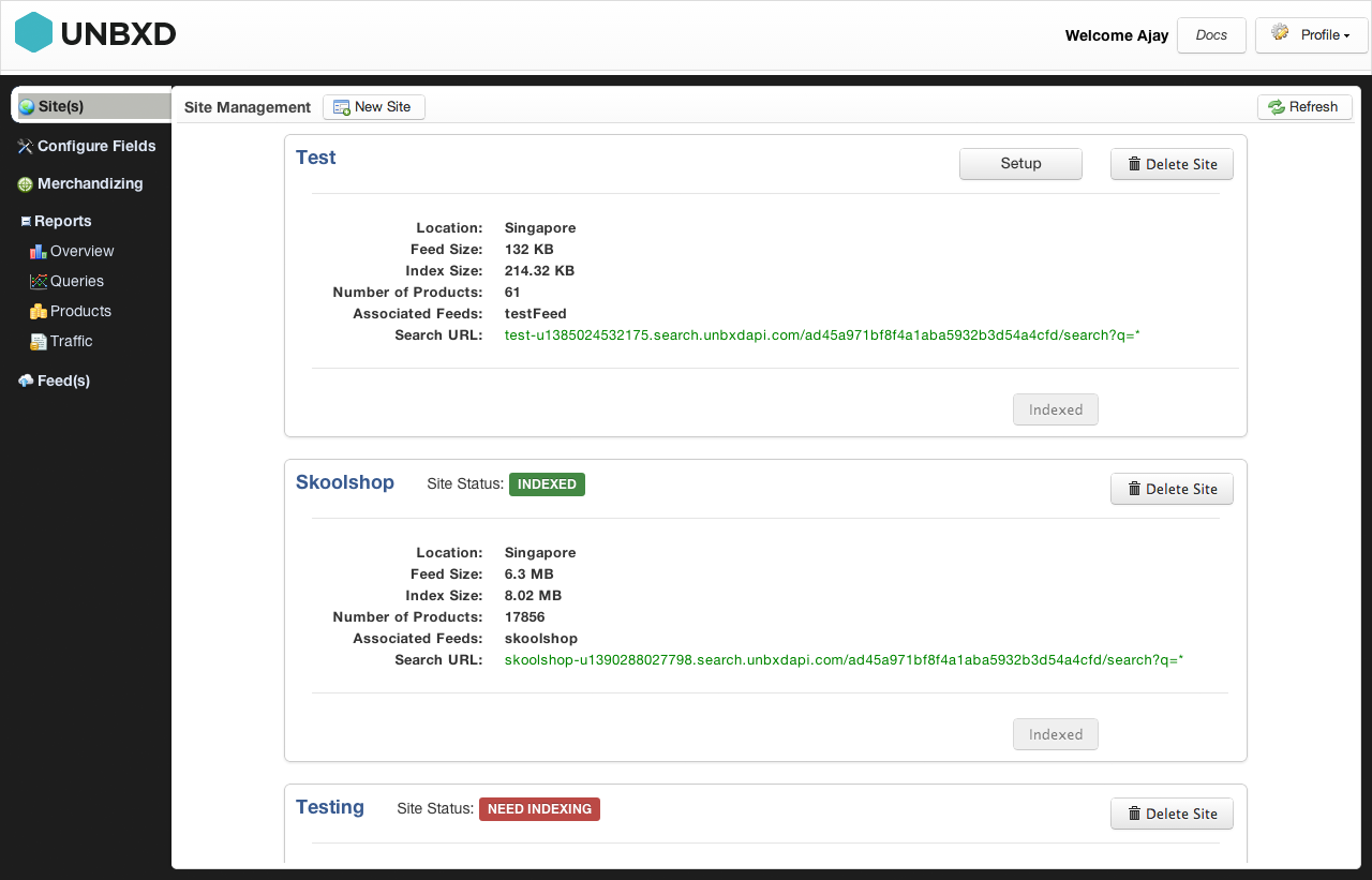
Original console — Site Management screen. Sidebar grouped by backend construct (Site(s), Configure Fields, Merchandizing, Reports, Feed(s)), not by merchandiser task.

Redesigned console — sidebar regrouped around merchandiser tasks (Query Rules, Campaigns, Analytics) instead of backend constructs.
The old console had no design system — each screen was a one-off implementation with inconsistent inputs, tables, and modals. I built a component library from scratch in Figma, covering form controls, data tables, filter chips, status indicators, and modals, then worked through implementation details directly with the front-end engineering team to make sure the Figma components and coded components stayed in lockstep. This became the shared language between design and engineering, cutting design-to-dev handoff time significantly and eliminating the class of bugs caused by inconsistent UI patterns.
Rather than exposing all configuration options upfront, I introduced a three-stage progressive disclosure model: Basic → Standard → Advanced. A merchandiser launching a seasonal promotion only needed to interact with 3 fields. A power user configuring NLP-based query boosting could access deep controls without those controls cluttering the standard flow. Prototyped and validated across 3 rounds of usability testing with 6 participants each.
The single highest-impact addition was a live search preview panel embedded directly into the rule and campaign configuration screens. Merchandisers could now type any search query and immediately see how their rule changes would affect result ranking — before publishing. This eliminated the "deploy and pray" workflow that had driven support ticket volume, and became the most praised feature in post-launch NPS surveys.
Friction point: Engineering raised concerns that running a live preview against the production search index on every keystroke would add latency and load risk during peak shopping hours. We resolved it by debouncing preview requests and routing them through a lightweight shadow index that mirrored production data with a short sync delay — preserving the "see it before you publish" experience without touching live traffic.
Query Rules — Precision Control Over Search Behaviour
Query Rules allow merchandisers to define exactly how the search engine should respond to specific customer queries — boosting, burying, redirecting, or filtering results based on the search term. Previously a developer-only feature accessed via API, I redesigned it into a fully visual, form-driven workflow.
The new interface introduces a condition-action model that mirrors everyday merchandising logic: "When a customer searches for [X], show [Y] first and hide [Z]." Each rule shows its current activation status, scope (site-wide, category, or query-specific), and estimated query volume — giving merchandisers the confidence to make changes independently.
- Visual condition builder — no query syntax knowledge required
- Scope selector: site, category, or individual query
- Rule conflict detection with inline warnings
- Estimated affected queries shown before publishing
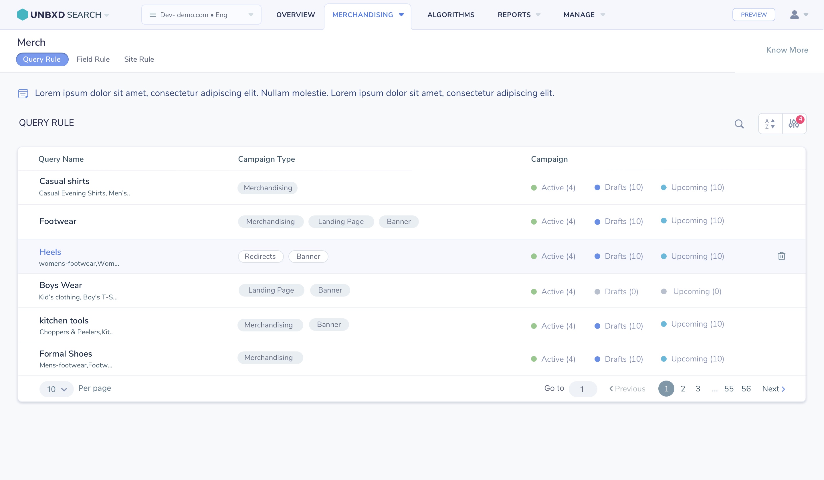
Query Rules console — visual condition-action builder replacing the previous API-based configuration.
Campaign Creation — Rule-Based Merchandising Control
Campaign Creation empowered merchandisers to control product discovery and search results through a flexible rule-based merchandising system. The platform enabled users to Boost products to increase visibility, Pin products to fixed positions, Slot products into reserved placements, Bury less relevant items, Filter products based on business rules, and create Redirects for specific queries.
Campaigns could be targeted to search terms, categories, customer segments, or promotional events, allowing retailers to quickly respond to seasonal trends, inventory changes, and marketing initiatives. Combined with scheduling, analytics, and AI-powered ranking, the feature gave business users direct control over search experiences without requiring engineering support.
- Six rule types: Boost, Pin, Slot, Bury, Filter, and Redirect
- Targeting by search term, category, customer segment, or promotion
- Scheduling for seasonal and time-limited campaigns
- Live preview before publishing any rule change
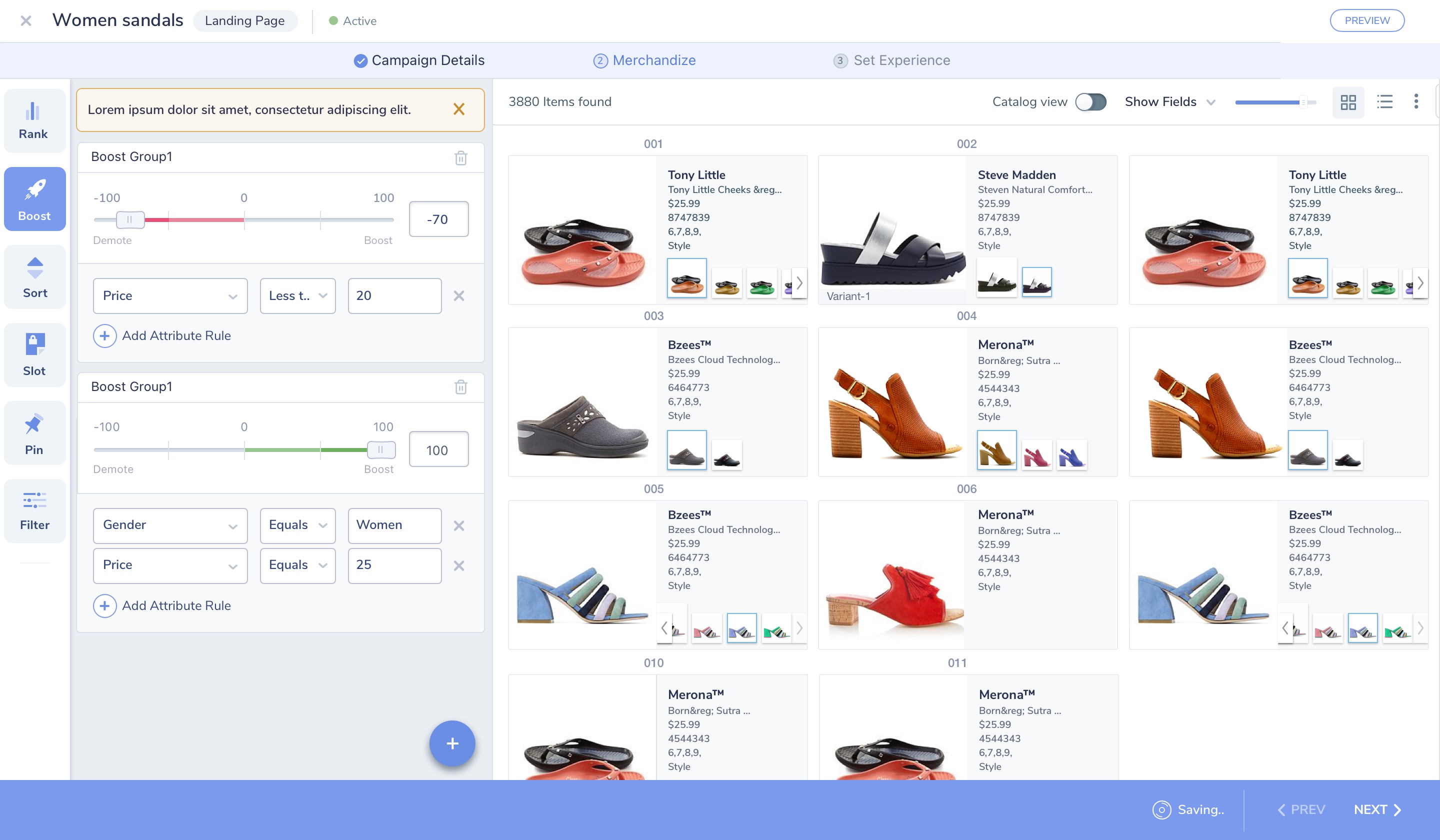
Campaign builder — Boost rules with attribute conditions (price, gender) applied to a live product grid, alongside Rank, Sort, Slot, Pin, and Filter controls.
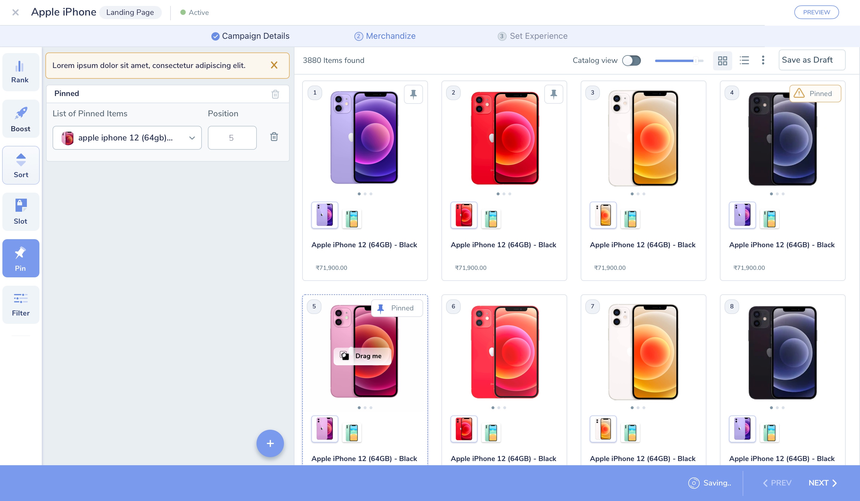
Pin rule — merchandisers fix specific products to exact grid positions, with drag-to-reposition and a live "Pinned" indicator on the product card.
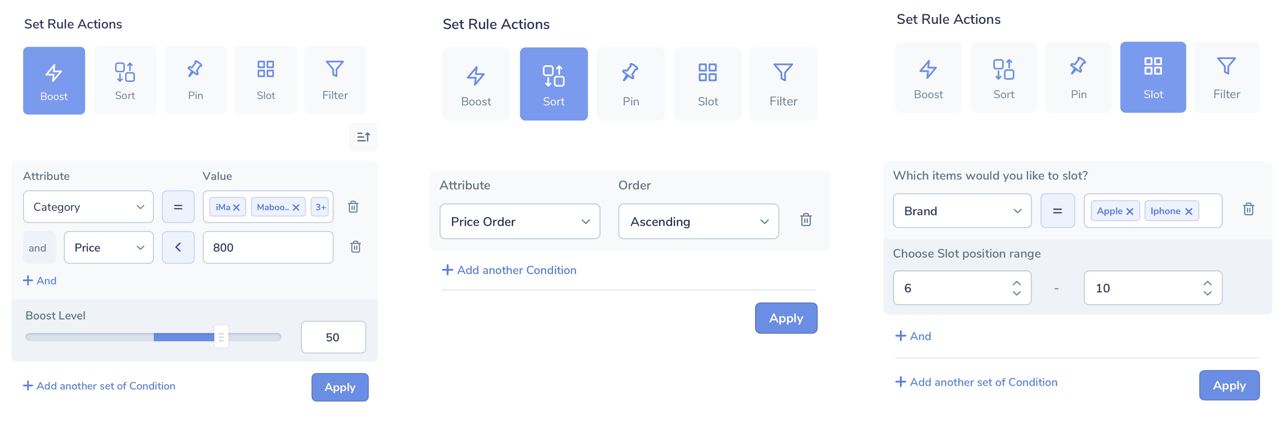
Set Rule Actions — Boost (attribute conditions + boost level), Sort (price order), and Slot (brand condition + position range), each with its own tailored rule-builder.
Redirects — Turning Dead-End Searches into Discovery
Searches for out-of-stock items, discontinued products, or common misspellings previously landed shoppers on an empty "no results" page — a guaranteed bounce, and one of the clearest drivers of the search-failure rate the Merchandiser persona was already fighting.
Redirects let merchandisers map a specific query, or a broader pattern, directly to a category page, landing page, or curated collection — turning a dead end into a guided next step. Configured as one of the six campaign rule types, Redirects could be scoped to an exact query or pattern match, scheduled like any other rule, and tracked for how many searches they actually recovered.
- Exact-match or pattern-based query targeting
- Redirect to a category, landing page, or curated collection
- Scheduling and expiry, consistent with other campaign rules
- Recovery tracking: searches caught vs. previously abandoned
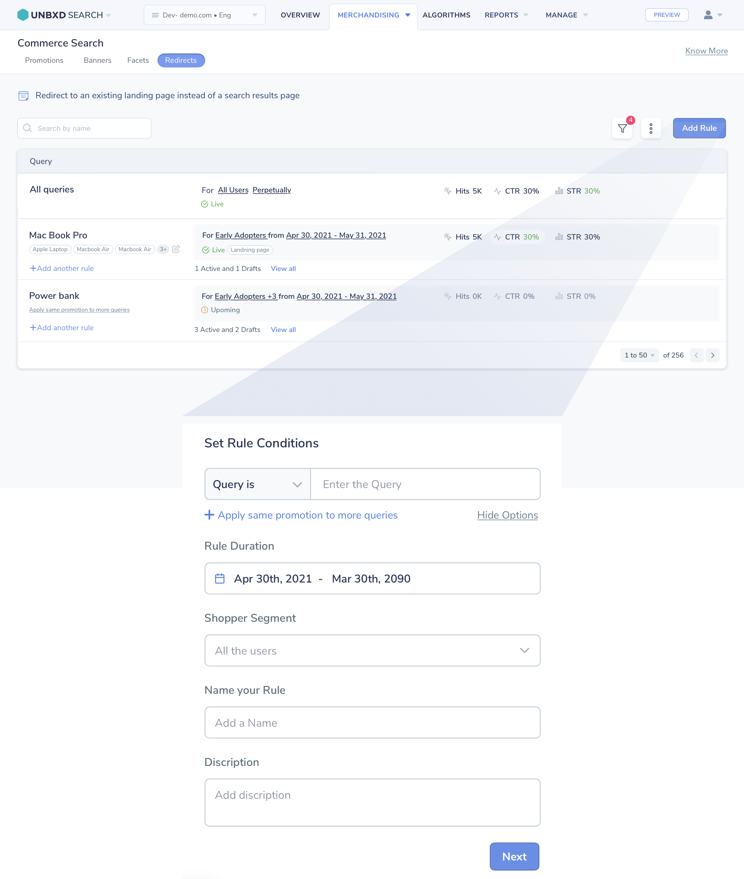
Redirects console — active rules with Hits, CTR, and STR per query, and the rule-builder for setting query match, duration, and shopper segment.
Algorithms — Unbxd's AI-Powered Relevance Engine
Algorithms is Unbxd's relevance engine, improving product discovery across three layers: Content algorithms that strengthen search understanding through synonyms, concepts, phrases, and spell correction; Intent algorithms that use NLP and semantic search to interpret what a shopper means beyond the literal keywords they typed; and Ranking algorithms that dynamically surface the most relevant products using real-time behavioural signals.
I designed the Ranking console so merchandisers could see and tune exactly which signal was driving results — User Behavior, Popularity, Freshness, Trending Products, Personalization, and Autosuggest Ranking — without needing a data scientist to interpret a model. Each model exposes its training configuration (query volume, observation window, clickstream and catalog weightages) in plain, merchandiser-facing language, while still giving power users the dials to customise it. Together, these layers help retailers deliver more relevant search, increase engagement, and drive conversions — while keeping merchandising control in human hands.
- Content: synonyms, concepts, phrases, and spell correction
- Intent: NLP and semantic search beyond literal keyword matching
- Ranking signals: User Behavior, Popularity, Freshness, Trending, Personalization, Autosuggest
- Transparent, editable model configs — query volume, observation window, signal weightages
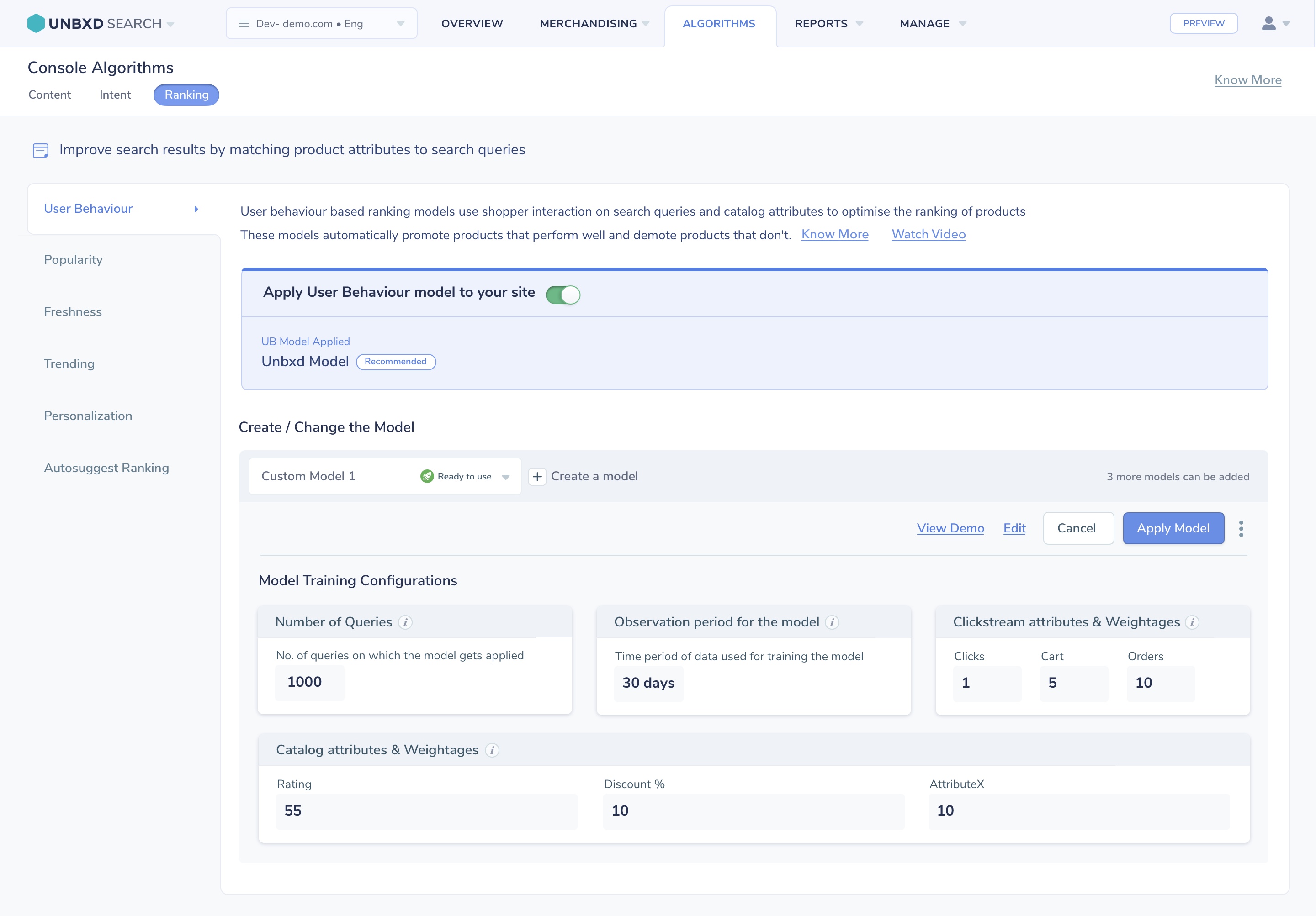
Ranking Algorithms console — User Behaviour model configuration, with clickstream and catalog attribute weightages exposed for merchandiser control.
Analytics & Reports — Insights Merchandisers Can Actually Act On
The original reports section was a table of raw search event logs — technically accurate but entirely unactionable for a merchandiser. There was no visualisation, no trend context, and no connection between the data and the decisions the merchandiser needed to make.
I redesigned the analytics experience around three key merchandiser questions: What are customers searching for? Where are they not finding it? And what's performing best? The new dashboard surfaces top queries, zero-result searches, click-through rates by query, and revenue attribution — with trend arrows, period comparisons, and direct links from a data insight to the relevant rule or campaign that can address it.
- Top search queries ranked by volume, CTR, and revenue influence
- Zero-result and low-CTR query highlighting with suggested actions
- Period-over-period comparison with trend indicators
- Direct "Fix this" link from insight to Query Rules console
One Screen to Understand Everything
The Commerce Search Overview dashboard was designed as the platform's homepage — a single screen giving merchandisers immediate situational awareness. It answers: how is search performing right now, what changed from yesterday, and what needs my attention?
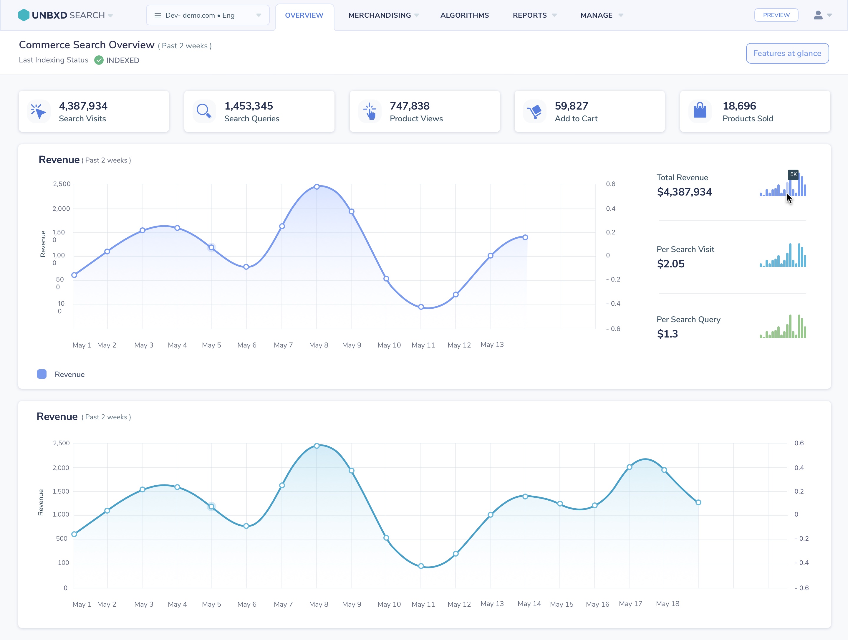
Commerce Search Overview — real-time session counts, revenue, top queries, and trend graphs in a single-scroll dashboard.
What We Didn't Build — And Why
As the sole designer responsible for the redesign, I had to make deliberate trade-offs within a six-month delivery timeline. Discovery revealed that merchandisers' biggest challenge wasn't a lack of experimentation tools—it was a lack of confidence when making changes. I therefore prioritized foundational improvements such as information architecture, workflow clarity, and live preview capabilities over a native A/B testing solution.
Although A/B testing was a recurring customer request, it was intentionally deferred to a future phase. By focusing on visibility and feedback first, I addressed the highest-impact user pain points while establishing a foundation for future experimentation capabilities.
Self-Service Up. Support Tickets Down. Revenue Up.
The redesigned console launched progressively across the client base over a 3-month rollout. Impact was measured by comparing 60-day pre- and post-launch windows across the same 20 retailer accounts, controlling for seasonal demand swings to isolate the redesign's effect from normal traffic fluctuation. The results showed substantial improvements in platform adoption, operational efficiency, and search-driven revenue.
Navigation and configuration-related support tickets dropped within 60 days of launch, freeing the Customer Success team to focus on strategic work.
Monthly campaigns created by merchandisers (without engineering involvement) tripled post-launch, directly correlating with increased conversion during promotional periods.
Average click-through rate on search results improved as merchandisers began actively tuning rules and pinning products — a capability they previously avoided due to console complexity.
Key learning: The most impactful design decision wasn't visual — it was the live preview panel. Giving merchandisers the ability to see consequences before committing to them completely transformed their relationship with the platform. Confidence, not capability, was the real barrier.
The component library and IA framework built for this redesign didn't stay contained to the merchandising console — they became the starting point for the Automated Onboarding redesign that followed, cutting design-to-dev time on that project from day one.
What I'd Do Differently
Looking back, there's one thing I would approach differently given what I learned:
More collaborative rule-naming with customers. I standardised the terminology in the console (Query Rule, Campaign, Slot) based on competitive benchmarking — but discovered post-launch that different retailers had deeply ingrained internal vocabularies. A co-creation workshop earlier in the process would have surfaced this sooner and made the labelling feel more natural across our diverse client base.